Designing Your Boutique’s Logo
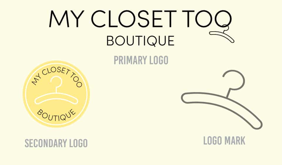
If you are thinking about opening up a boutique or rebranding one that has been around for some time, you may be wondering:how do I make a logo for my boutique? There are many factors to consider when creating a logo for your boutique! The logo you create will be the first impression your customers experience when it comes to your boutique, so it is important to spend time on a logo that will express the message you want to come across to your customers. A logo uses the psychology behind colors, fonts, and aesthetics to grab the attention of your customers and give them a taste of what your boutique is like. We at MORE recently designed branding for My Closet Too, an online boutique based out of Douglasville, Georgia. (Want to know the difference between branding and a logo? Click here.) We used the psychology of color, font, and aesthetic to create a brand and logo that welcomed customers to an open, friendly, modern boutique.
What colors do I use?
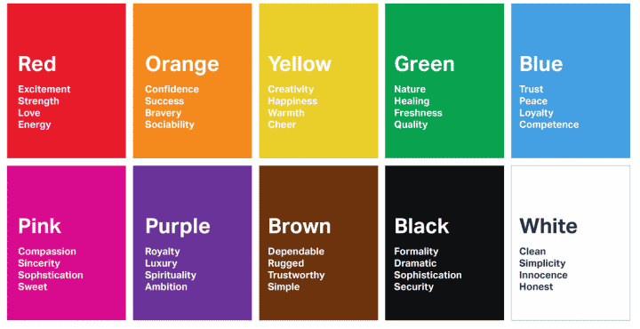
What color do you associate with the feeling of happiness? How about sadness, or shopping, or food, or even relaxation? Colors affect our brains more than we realize. We associate certain colors with specific moods, feelings, and even actions. The psychology of colors is deeper than associating blue with the sky or green with grass. Colors can actually influence us to feel a certain way or to make a decision. Red often evokes passion, attention, and danger. Blue typically evokes calm, peace, and coolness. Yellow customarily evokes happiness, friendliness, and warning. Colors will not only evoke emotions within you but also cause you to take action like purchasing a meal or deciding to subscribe to one streaming platform instead of another. While designing the branding and logo for My Closet Too, we collaborated with the client to decide the brand we wanted customers to remember the boutique by. The client wanted My Closet Too to be welcoming, modern, and to have lots of energy. We chose yellow as the primary branding color and it is used in the secondary logo. The primary logo goes for more of the modern aspects with a sleek black and white look. Whatever you want your boutique to represent, researching the psychology behind each color will be imperative when choosing the colors for your logo. Special thanks to Usertesting.com for the image below.
Are fonts really that important?
Fonts are similar to colors in that they affect our perceptions and decisions on a day to day basis more than we realize. There are several different font families, but the most common categorizations are serif, sans serif, script, and decorative. These font families contain thousands of fonts within them, but we will focus on the major font families and their associations. Serif fonts are typically seen as sophisticated or traditional. Most books and many printed texts use a serif font. Sans Serif fonts are often viewed as modern or clean. Script fonts are customarily seen as elegant or personal. Finally, decorative fonts are predominantly seen as flexible or creative.

What is a logo’s aesthetic?
A logo’s aesthetic is made of several elements, including color, font, and shapes. When a logo is aesthetically pleasing, it is nice and easy to look at. Logos should be beautiful and timeless. If you follow too many trends while trying to design an aesthetically pleasing logo, you will have to redesign your logo in a few years or even a few months.

You now have the tools to make big decisions and design your boutique’s logo! For a more step by step logo designing tutorial, click here. At MORE, we want to help businesses recognize their value, so we are more than happy to work with you to design your boutique’s logo and branding. We are a full service creative agency that specializes in branding and web design, based out of Athens, Georgia. Contact us to work with us to fulfill your boutique’s creative needs.


