


If you run a local business, you already know that most of your customers find you online. What many owners don’t realize is that most of those visitors are finding you on their phones. In Athens, GA and everywhere else, 63% of visitors access websites on their mobile phones, which means that if your site is hard to use on a phone, customers won’t stick around long enough to call, book, or buy.
A “responsive” website simply means it adapts to every screen size. But just because your site loads on a phone does not mean it’s actually easy to use. Below are the most common signs your website isn’t truly responsive, and how they affect your traffic, your leads, and your bottom line.
1. Your Text Overlaps, Runs Off the Screen, or Shrinks Too Small
If a customer has to pinch and zoom just to read your content, they’ll leave. Overlapping paragraphs, cut-off headlines, or text that shrinks to ant-size are major indicators your site isn’t set up for mobile breakpoints.
Why it matters:
Customers won’t read what they can’t see. Google won’t rank content that isn’t mobile-friendly.
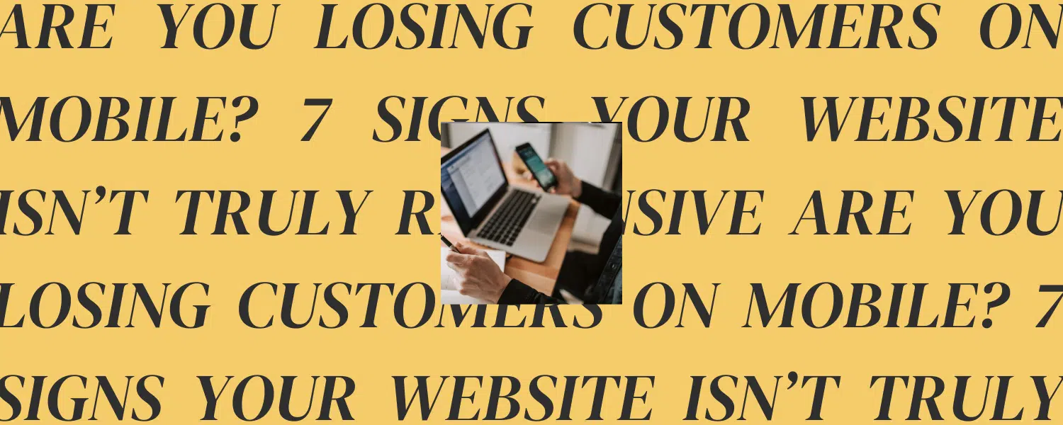
2. Your Buttons Are Too Small to Tap
Tiny “Contact Us” buttons, crowded menus, or links placed too close together create frustration. If visitors keep tapping the wrong thing, they leave.
Why it matters:
Conversions drop dramatically when calls-to-action are hard to tap. If customers can’t click your phone number, you’re losing leads.
3. Your Images Don’t Scale Correctly
Images that stretch, pixelate, or push text off the screen are a dead giveaway that your site wasn’t built for mobile.
Why it matters:
Unoptimized images slow down your site. Slow load times are one of the biggest reasons users bounce AND why Google may lower your rankings.
4. Your Site Takes More Than 3 Seconds to Load
On mobile data, speed matters even more. Large files, outdated code, and uncompressed images can make your site load painfully slowly.
Why it matters:
More than half of mobile visitors leave if a website takes longer than 3 seconds to load. Fast sites rank higher and convert better.
5. Your Navigation Is Confusing or Hard to Tap
If your menu gets cut off, the dropdown is glitchy, or the links are too small, users won’t explore your site.
Why it matters:
People don’t hunt for information. A confusing mobile menu sends them back to Google… where your competitors are waiting.
6. Your Page Layout Breaks on Tablets or Laptops
Many websites look okay on phones and desktops but completely fall apart on iPads or small laptops. Misaligned columns, content stacking in the wrong order, or giant white gaps all indicate poor responsiveness.
Why it matters:
With more people browsing on tablets, layout issues signal to Google that your site is poorly optimized, hurting your performance across devices.
7. Your Forms Are Hard to Use on Mobile
If your contact form, booking form, or email sign-up is difficult to fill out on a phone, your conversion rate plummets. Slow autofill, tiny fields, or forms that require too much information create friction.
Why it matters:
If your form doesn’t work smoothly, customers won’t complete it. That means fewer inquiries, fewer appointments, and fewer sales.
Why Mobile Responsiveness Directly Impacts Local SEO
Google ranks mobile-friendly sites higher, especially for local searches like “salon near me,” “best Athens coffee shop,” or “pool builders Athens GA.” If your site performs poorly on mobile, Google might not show you at all.
That means fewer clicks, fewer leads, and fewer opportunities to grow.
A responsive site:
- Loads faster
- Provides a better user experience
- Gets more engagement
- Has lower bounce rates
- Converts more visitors into customers
What Most Business Owners Don’t Realize
You can’t fix mobile issues with small tweaks. True responsiveness is built into the structure of your website: its layout, code, images, page design, and content strategy. If your site is more than a few years old, there’s a good chance it wasn’t built with today’s mobile standards in mind.
The good news? When you fix responsiveness, you instantly improve your customer experience and your SEO at the same time.
How MORE Helps Fix Your Mobile Experience
At MORE, we design every website with a mobile-first mindset. That means we test across all screen sizes, ensure every tap target works, and build layouts that naturally adapt to the way your customers browse.
If your site:
- looks outdated,
- loads slowly,
- breaks on mobile, or
- is losing leads you should be getting…
We can help you diagnose the issues and redesign your site for better performance and better results.