


Your logo is the face of your brand—its first impression. Get it right, and people will instantly recognize and connect with your business. Get it wrong, and you could be sending mixed messages, confusing customers, or worse, being completely forgotten. Whether you’re launching a new brand or reimagining your current look, there are some golden rules (and some serious no-nos) when it comes to logo design.
Let’s dive into the fun and creative world of logo design with these essential do’s and don’ts to make sure your brand gets noticed for all the right reasons!
The Do’s of Logo Design:
1. Do Keep It Simple
The best logos are often the simplest. Think of iconic brands like Nike, Apple, or McDonald’s. Their logos are clean, recognizable, and memorable. A simple design is easier for your audience to digest and recall. It also ensures your logo looks great in any size or format, whether it’s on a billboard or a business card.
Pro Tip: Don’t overcomplicate your design with too many elements. Stick to one or two standout features that define your brand.
2. Do Focus on Versatility
Your logo will appear in various places—online, on packaging, social media, and even merchandise. So, it’s important to design something that works across different platforms and sizes. Ensure that your logo looks just as impressive in black and white as it does in color, and can scale without losing its essence.
Pro Tip: Test your logo in multiple sizes and formats to guarantee it maintains its visual impact, no matter where it’s used.
3. Do Make It Timeless
A good logo should last for years. While trends come and go, your logo should stand the test of time. Avoid hopping on design fads that will make your logo look dated in a few years. Instead, focus on creating something classic and enduring that represents your brand long-term.
Pro Tip: Think about longevity and don’t just follow the latest design trend. Timeless doesn’t mean boring—it means lasting!


4. Do Choose the Right Colors
Color is a powerful tool in logo design. Different colors evoke different emotions, so choose shades that align with your brand’s personality and message. For example, blue conveys trust and professionalism, while red can evoke excitement and urgency.
Pro Tip: Use color psychology to your advantage, but don’t go overboard. Stick to a limited color palette for cohesion and impact.
5. Do Your Research
Before you finalize your logo, take a look at your competitors. What are they doing? How can you differentiate your logo from theirs? Your logo should stand out in your industry, not blend in with a sea of sameness.
Pro Tip: Look for opportunities to add a unique touch that sets your brand apart. Whether it’s a custom typeface or a clever symbol, your logo should feel original.
The Don’ts of Logo Design:
1. Don’t Copy Other Logos
Imitation is not the sincerest form of flattery in logo design. Steer clear of copying popular logos or borrowing too heavily from other brands. It can make your business look unoriginal and could even lead to legal trouble.
Pro Tip: Your logo should represent your brand’s unique identity. Make it yours, not a reflection of someone else’s work.
2. Don’t Overdo the Details
Too many details can clutter your logo, making it hard to understand at a glance. While intricate designs can be beautiful, they don’t translate well across all mediums. Logos with too many fine lines or complicated patterns can lose their impact when scaled down.
Pro Tip: Simplify your design by stripping away anything that isn’t essential to the message you want your logo to convey.
3. Don’t Use Too Many Fonts
Using more than two fonts in a logo can look chaotic and unprofessional. Stick to one or two complementary fonts that reflect your brand’s personality. A clean, consistent font choice ensures readability and keeps your design cohesive.
Pro Tip: Don’t go font-crazy. Choose a font that works well both in large and small formats and pairs with your logo icon.
4. Don’t Rely on Trends
Logo design trends come and go, but your brand identity should endure. If you lean too heavily on a trendy design (like the flat, minimalist styles that are in now), your logo might feel outdated when the trend fades.
Pro Tip: While trends can inspire, focus on creating a logo that feels authentic to your brand rather than chasing the latest style.
5. Don’t Forget Your Audience
It’s easy to get carried away with what looks cool, but don’t forget the people who matter most—your customers. Your logo should speak to your audience, making an emotional connection that resonates with them.
Pro Tip: Always keep your target audience in mind. What do they want to feel when they see your logo? Use that to guide your design choices.
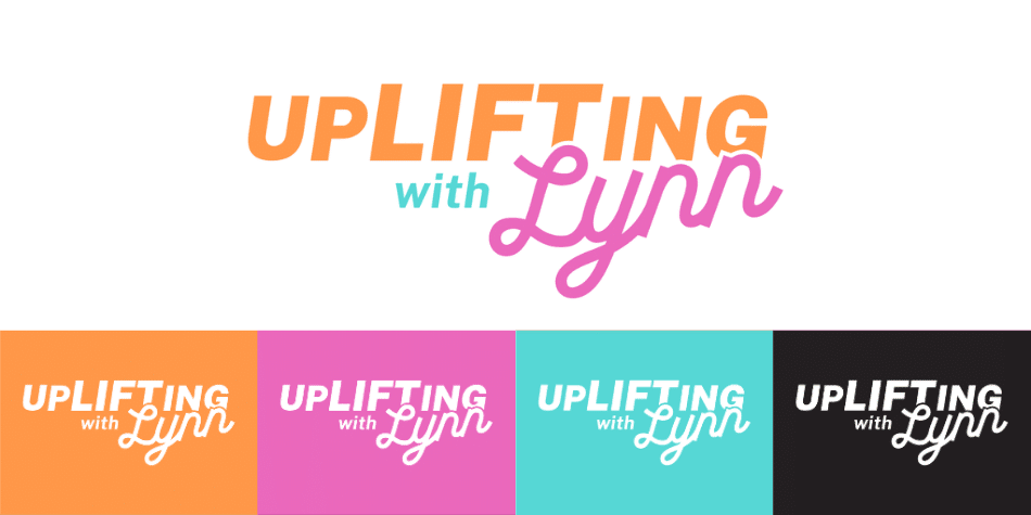
Take our client UpLIFTing With Lynn, for example. An important part of UpLIFTing With Lynn’s branding is her compassionate and empowering approach, guiding women through life’s transitions with empathy and resilience. Understanding the essence of her mission, we crafted a sporty-looking logo that embodies strength without directly referencing a gym. This design perfectly aligns with her empowering message, providing a logo and icons that reflect her commitment to helping women find strength and navigate change with confidence.
Ready to Design the Perfect Logo?
Your logo is a crucial piece of your brand identity. By following these do’s and avoiding these don’ts, you’ll be well on your way to creating a logo that is memorable, versatile, and timeless.
At MORE, we specialize in helping businesses—just like UpLIFTing With Lynn—create logos that stand out and resonate. Whether you’re starting from scratch or looking for a logo refresh, our team is ready to bring your vision to life. Contact MORE today, and let us help you with logo design in Athens, GA that captures the essence of your business and leaves a lasting impression!
Your logo says a lot about your brand—make sure it’s saying all the right things with MORE!